UK House Price Analysis
An end-to-end analysis of England and Wales residential property transactions from 2024 to 2026, measuring how price growth diverged across property types and regions — and identifying where that divergence began. Raw CSVs were loaded into Oracle with SQL*Loader, cleaned and modelled in SQL, then connected live to Power BI for a three-page interactive dashboard.
- Analysed three years of England & Wales residential transactions (2024–2026) in a single unified dataset.
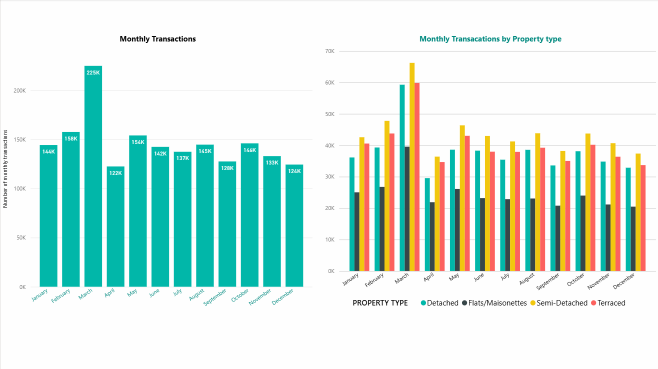
- March is the peak month for transactions at 225K — roughly 55% above the quietest months.
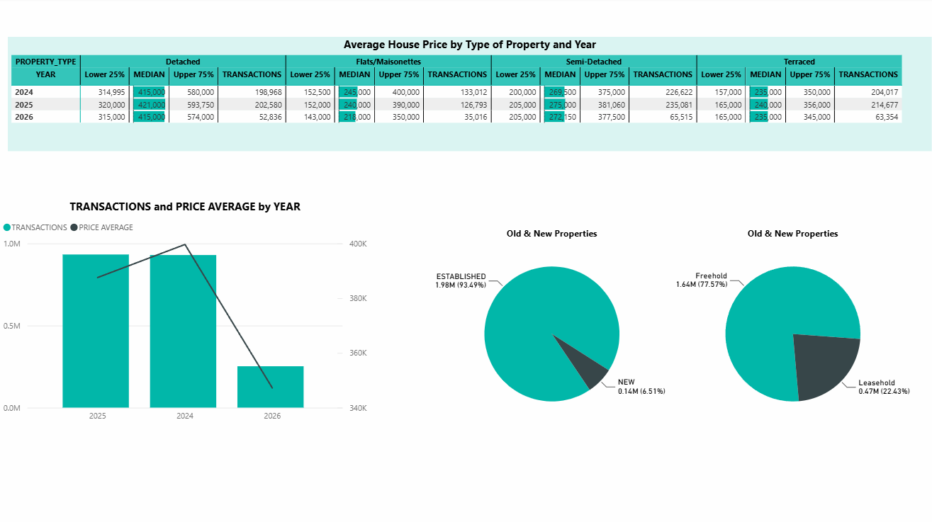
- The market is 93% established properties and 78% freehold.
- Detached homes command the widest price spread, with an upper quartile near £580K against a median of £415K.
- Built an end-to-end pipeline: SQL*Loader → Oracle → live Power BI connection → 3-page dashboard.
Three-page interactive report
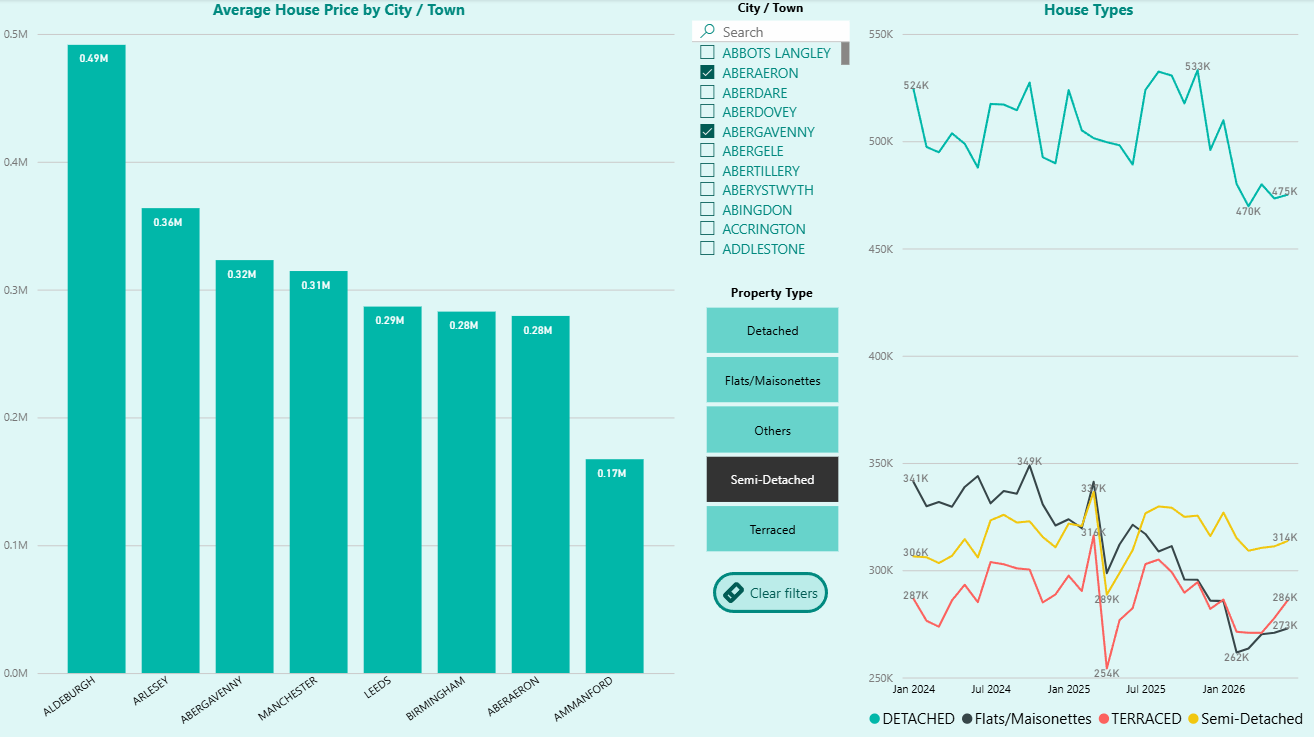
From raw CSVs to a live dashboard
Importing three years of raw data
The project starts with three separate CSV files — one each for 2024, 2025 and 2026 — covering residential property transactions across England and Wales.
The raw files arrived without consistent headers, so I first added the correct column headers and split the data into its proper columns in Excel. I then created a fresh Oracle database and set up a dedicated user account rather than working under SYSTEM, which is better practice for keeping project work isolated.
Next I wrote the DDL to define every column, ready for loading.
Debugging the load and fixing the schema
Running SQL*Loader on the first file, only 500 rows made it in. Reading the log file showed why: I'd defined the string columns too short, so anything longer was being rejected.
I widened the affected columns, truncated the table, and re-ran the import. This time every row loaded cleanly with exactly one rejection — checking the .bad file confirmed it was just the header row, which is expected.
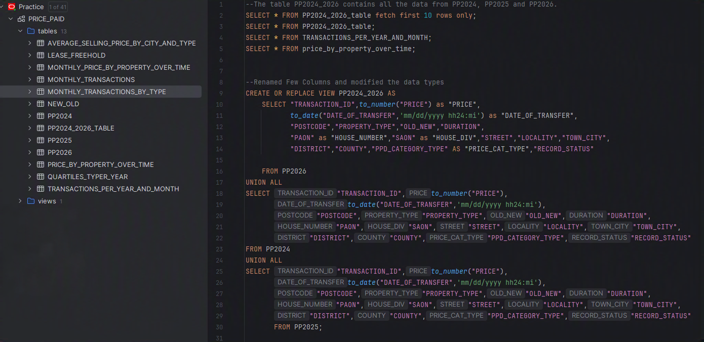
I repeated the process for the other two years into their own tables, then created a view that UNIONs all three years into a single dataset.
 ⤢ expand
Cleaning the data and building a working table
With everything in one place, I rewrote the view to give the columns clear, intuitive names and cast each one to the correct data type — prices as numbers, transfer dates as real dates rather than text.
I then materialised the view into a physical table. Views recalculate every time they're queried, so for a dataset of this size a table makes the downstream analysis much faster to work with.
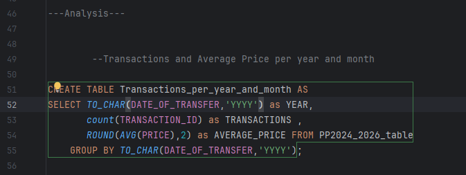
Transactions and average price per year
The first analysis question: how do transaction volume and average price move over time?
This query groups every transaction by year, counts them, and calculates the rounded average price. The result becomes the foundation for the year-on-year trend chart in Power BI.
 ⤢ expand
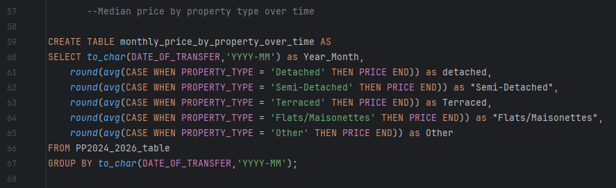
Median price by property type over time
To compare how different property types behaved, I pivoted the data by month using CASE statements — one column each for Detached, Semi-Detached, Terraced, Flats/Maisonettes and Other.
This shape is exactly what Power BI needs to plot all five property types as separate lines on one chart, making divergence between them immediately visible.
 ⤢ expand
Average selling price by city and property type
This query breaks the market down geographically, aggregating average price by town/city, property type and month.
It powers the bar chart and the searchable city filter on the dashboard, so a user can drill into any specific location.
 ⤢ expand
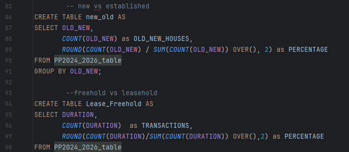
New vs established, freehold vs leasehold
Two market-composition questions answered with the same technique: count each category, then use a window function — SUM(COUNT(...)) OVER() — to work out what percentage of the total each one represents.
The results feed the two pie charts showing that the market is overwhelmingly established properties (93%) and predominantly freehold (78%).
 ⤢ expand
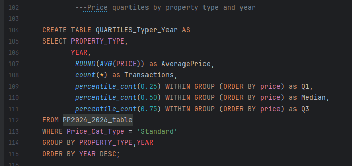
Price quartiles by property type and year
Averages alone hide the spread of a market. Using PERCENTILE_CONT I calculated the lower quartile (25%), median (50%) and upper quartile (75%) for each property type in each year.
Filtering to standard-category sales keeps the figures representative by excluding unusual transaction types. This produces the detailed quartile table on the dashboard's third page.
 ⤢ expand
Seasonality analysis
The final question: does the housing market have a seasonal rhythm?
I grouped transactions by calendar month to get an overall picture, then built a second version broken down by property type using UNION ALL to stack each type's results together.
March stands out sharply at 225K transactions — well above every other month.
 ⤢ expand
Connecting to Power BI and building the dashboard
With the analysis tables built, I connected Power BI directly to Oracle via a live SQL connection rather than exporting static files — so the dashboard reflects the source data.
I then built a three-page report: market overview with city and property-type filters, seasonality analysis, and a detailed quartile breakdown with market-composition pies.